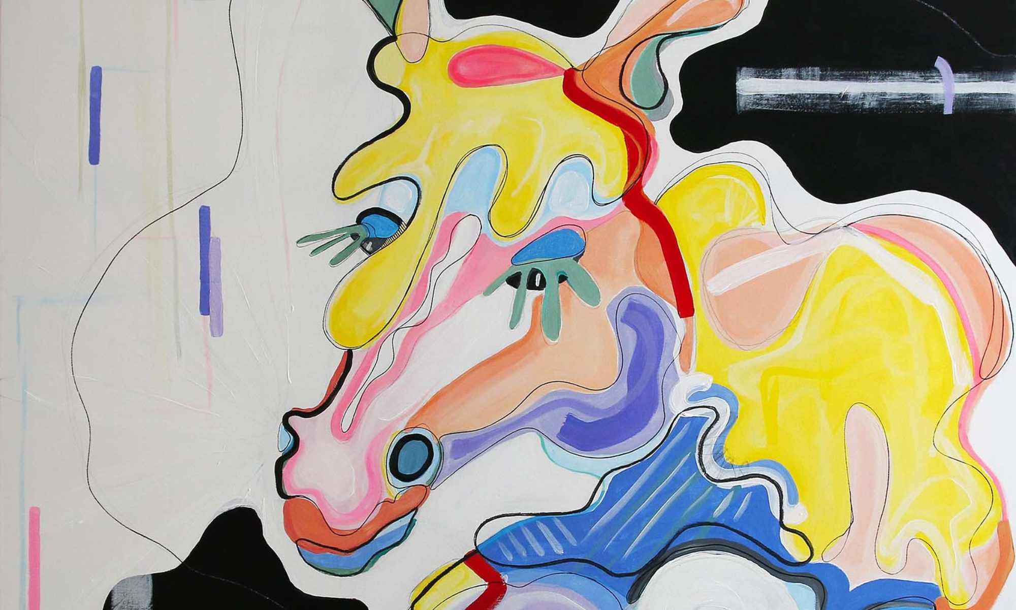
Two improvisations.
Using acrylic and charcoal on medium sized paper and cardboard.

Titled “Outside”, Patterns #5 is a colorful abstract work using a wide variety of different forms. It definitly seems a bit chaotic and unfocused. What I don’t like is how the assembly of the colors worked out in the end. Altough it is very colorful and bright, it is missing depth and contrast, so I think. Otherwise, the movement of the lines in the lower left part forms a nice contrast to the bigger and static laminar events in the upper part of the painting. So I guess, it is kind of an ambivalent solution.

Patterns #6, Titled “Inside”, in my opinion definitly has more depth and power than #5. The reduced variety of colors and a more efficient composition renders this one more satisfying to consume. At least to me, this one seems more interesting.
So, why are they titled “Inside” and “Outside”? If you compare these two it seems like one painting is the logical counterpart to the other. While #5 has more obvious and simpler structures that you can follow superficially, #6 demands a stronger interpretation of the open and more simplistic structure. And although this was not intended it is an aspect of these two abstract paintings I have to think about, particularly considering the fact that both pantings were generated successively.

